Refused artworks
In June 2024 Helloween’s manager contacted me to potentially create the artwork for the band's "Best Of - 40 Years" album. I immediately responded that I was interested and that would send him my initial concepts soon...
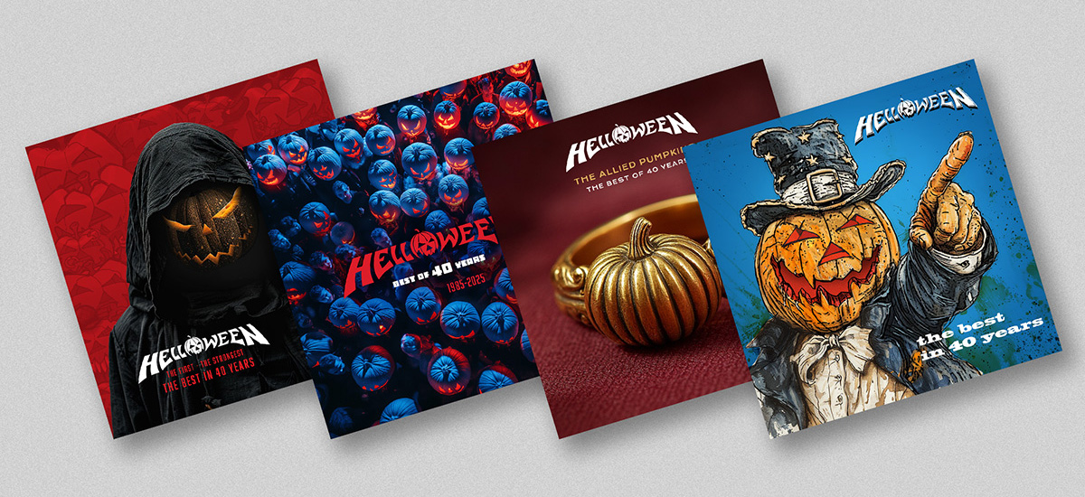
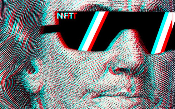
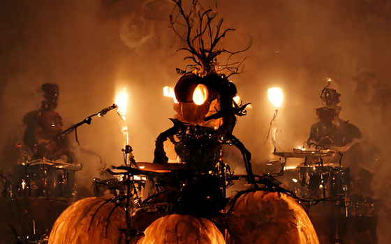
I first wanted to experiment with Midjourney to get a sense of what the management and record label liked or disliked. So, I started with a few images based on pumpkins (see the gallery below). The cloak from "Time Of The Oath" with a pumpkin face, a crowd of pumpkins seen from above, a pumpkin-shaped ring, and even a "trash" version of the artwork I originally designed for the "I Want Out" single…
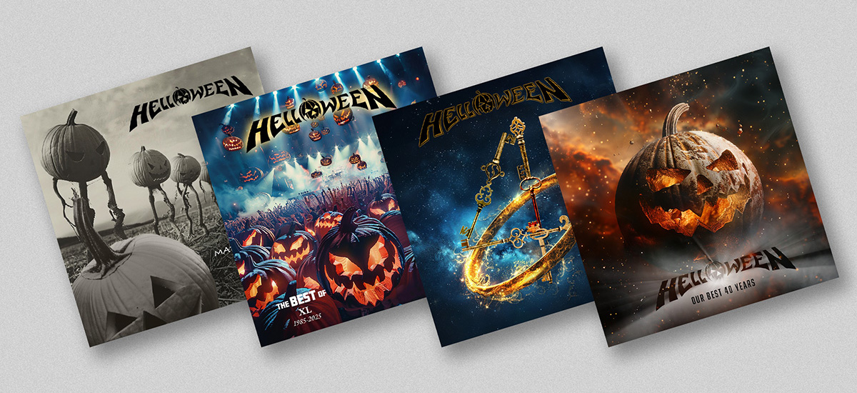
Next, I had the idea of incorporating the keys from the "Keeper Of The 7 Keys" albums along with rings inspired by the "Master Of The Rings" album — an album I had originally designed 30 years earlier in 1994, already using Photoshop at the time. For this project, I mainly used Photoshop with a bit of Midjourney to create backgrounds and rings. At the time of these experiments, the album title had not yet been decided, which explains the different title variations I imagined to accompany my visuals.
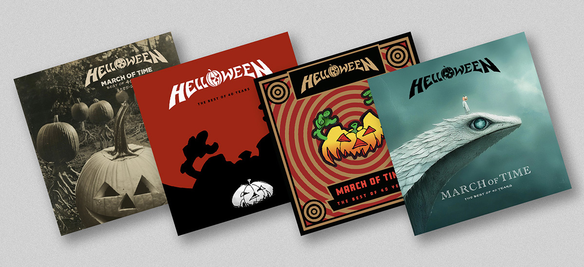
A third concept I explored was creating a "Pumpkin Planet" using Midjourney again. But my favorite version was the "creepy" one, inspired by 1920s-1930s imagery of eerily carved pumpkins, supposedly photographed in rural areas. You can see this in the gallery at the bottom of this page.
Unfortunately, none of these concepts appealed to either the management or the record label. Nothing was shown to the band. The manager told me that their team was hoping for something more personal, in the style of my hand-drawn works from the 1980s, and that what I was presenting felt too generic and lacked personality. Later, the record label shared their own idea of using a ring as the main visual, and they had finalized the album title: "March Of Time." I quickly put together a few concepts using Midjourney, but I wasn’t convinced. Neither were they.
A few weeks later, the record label informed me that they had decided not to move forward with me and had instead assigned their in-house graphic designer to create the album artwork.
I understand their point of view.
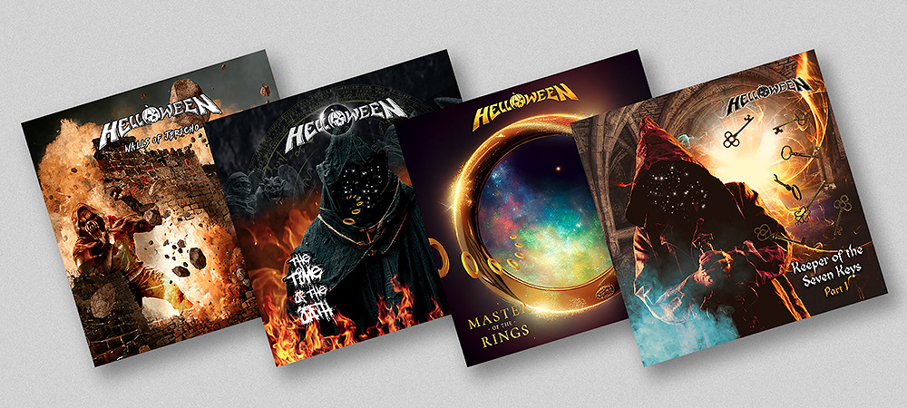
I had assumed they had approached me because of my recent work reinterpreting their classic album covers (which can all be seen here) and that they liked it — just as the management had indicated at the time. But apparently, they were expecting hand-drawn illustrations and, above all, a strong visual concept. The record label did ask if they could use one of my previous designs (a reimagined version of the "Keeper Of The 7 Keys" cover) as a puzzle bonus for the physical album release, but I politely declined their offer.
That being said, I have no hard feelings — I fully understand the gap between what they were expecting and what I delivered. The challenge with tools like Midjourney or Photoshop is that even an early concept looks too much like a finished product. As a result, it becomes difficult to envision a refined final version when the initial drafts already appear polished.
But the story may not end there. In February 2025, the manager contacted me again and wrote the following: "Work in the studio is progressing well, and the band is slowly starting to think about the title and cover art. We now have two graphic designers in the pitch regarding ideas for a front cover, and I wanted to hear if you would also be interested in making suggestions." So, this time, I picked up my pencils again, not the computer, to make new proposals...
Nonetheless, I invite you to explore these old design experiments below.
Under each image, I explain why the visuals or ideas were rejected.


